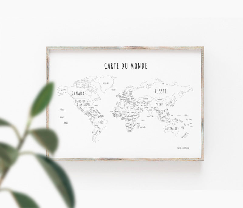
I don’t know about you, but, personally, I can spend hours in front of a world map. I travel with my eyes from one continent to another and I am fascinated by the greatness of our planet, which is nevertheless so small in the vastness of the universe. It makes me feel small, but also special and privileged to live on the planet where life was created. I point my finger at a place and I find myself inwardly telling myself that there, under my finger, there are thousands of people who live there, with their culture and customs, and I have only one desire: to go and meet them.
One day, I started drawing my own world map. Careful by nature, I wanted my maps to be as faithful as possible to reality. It was by looking at tons of images of maps of the world that I discovered the different ways of drawing them, called projection. There is no need to say, some of them are strange and yet it is the strangest projections that best preserve the proportions of continents.
“Dominique, are you implying that the most common world map that we know, the one that represents the Earth flat, misleads us about the size of continents?”
Yes! and this projection is called:
Mercator’s Projection
Picture: Wikipedia
Developed by Gerardus Mercator around 1550, Mercator’s projection is one of the oldest. However, it remains the most used, because to the eye, it is the one that is the most aesthetic. However, this type of cylindrical projection that retains angles has the defect of distorting the size of continents. For example, Greenland appears to be larger than South America, while it is 6 times smaller.
Fortunately, others have looked at the proportion of continents so other projections have emerged.
Postel’s Projection
Picture: Wikipedia
In 1580, Guillaume Postel proposed an equidistant azimuthal projection that gave the impression of looking at the Earth either above the North Pole or the South Pole. It is quite normal that this projection seems familiar to you since it is used as the United Nations’ emblem.
https://melusine.eu.org/syracuse/mluque/mappemonde/postel/
The Projection of Cassini
Picture: Wikipedia
Designed by Thury’s César-François Cassini in 1745, this now-forgotten projection is designed in the same way as the Mercator projection. The difference, however, is that the globe was reversed by 90 degrees during the projection operation. The Earth is therefore represented on a vertical plane (and not horizontal like the Mercator projection) which distorts the continents and makes it difficult to read.
The Projections of Bonne, Sanson-Flamsteed, and Werner
Picture: Wikipedia
The projection of Bonne was suggested around 1780 by the French hydrographer Charles-Marie Rigobert Bonne. It is a map projection that requires that the parallels be concentric circles at equal distance. This projection has its original parallel at 45 degrees. By changing the parallel to 0 degrees, we will have a projection by Sanson-Flamsteed, and by changing the parallel to 90 degrees, we will have the Werner projection (heart-shaped).
The Projection of Mollweide
Picture: Wikipedia
In 1805, Carl Brandan Mollweide suggested a pseudo-cylindrical projection, resembling a crushed sphere, which preserves the size of continents, but renders them deformed. Its compact appearance makes it the option of choice for planispheres.
The Projection of Albers
Picture: Wikipedia
In the same year, the conical projection of Albers, named after Heinrich C. Albers, was created, which had the strength to retain the proportion of each continents. It is the official projection in British Columbia and the Yukon.
The Gall-Peters Projection
Picture: Wikipedia
In 1855, James Gall and Arno Peters created a new cylindrical projection that, like Mollweide’s projection, preserved the size of the continents, but rendered them deformed.
Goode’s Projection
Picture: Wikipedia
Invented in 1923 by John Paul Goode, Goode’s pseudo-cylindrical projection, which some people have fun calling ‘orange peel’, is a surprising cut-out that, however, preserves the size of the continents by distorting them slightly less than the Gall-Peters and Mollweide projections.
Fuller’s Projection
Picture: arcgis.com
In 1946, Richard Buckminster Fuller suggested a projection by depicting the Earth as a 20-sided polyhedra.
Unique, this projection has several properties that distinguish it from more traditional projections:
- It retains almost perfectly the size of the continents, compared to the projections of Mercator and Peters.
- It is not oriented according to the poles: the North is not at the top, and the South is not at the bottom.
- It represents the continents of the Earth as a single large island in a single ocean.
- It can be cut and rebuilt in many ways.
Authagraph’s Projection
Picture: Wikipedia
Developed in 1999 by the Japanese architect Hajime Narukawa, Authagraph’s projection is inspired by Fuller’s projection using a 96-sided polyhedra instead of 20. The result is much the same, albeit a little more accurate than Fuller’s projection.
It’s exciting, don’t you think? So now that you know more about the projections, tell me which one I use for my coloring world maps.
Hoping that, like me, you will spend hours traveling on my coloring world maps or my world maps on canvas.


